Curating my first exhibition
- Nov 5, 2016
- 3 min read
I offered to help curate the exhibition this week in a team of 4 people. I've never had the opportunity to be a curator before so was intrigued as to the process.
Layout
As team we first laid out each piece of work and decided how we would hang it - we came to the conclusion that it would be interesting to have the layout at eye-level where possible and going around the room in one line ordered by colour (starting at black and white, into oranges, greens, yellows, brightly/multi-coloured, blues, purples and then back around to black and white). Once we had the pieces arranged into an order we laid them out around the room (on the floor) to see what space we had available and how they filled the room.
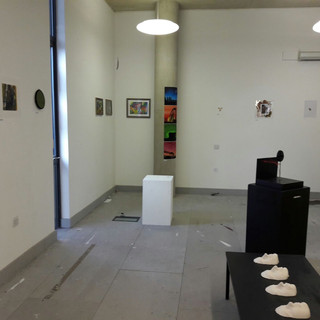
For the sculptural/3D pieces we arranged plinths in the middle of the room almost reflecting the outer shape so that it would encourage people not only to walk around the edge but into and around the middle, seeing the whole show from a number of angles. I think this layout really worked and make people not only look at work close up but also from a distance. It also encouraged people to talk to each other as they moved in and around the space.
Problems
The first problem encountered was that the space was quite dirty, the walls had splash marks and paint all over them and were covered in blu-tack so the first job was to paint all the walls and plinths which then meant we had to wait for them to dry before we could move on with the next stage. This was only a minor problem though as we had a number of people help with this and we did a lot of the planning in the drying time.
The main problem we found was that the artists were not on time and once we had already come to an agreement on layout and started to hang the work people kept bringing in more and more work, putting it somewhere they wanted it to be and then leaving. It caused a lot of problems for the spacing of the exhibition as we had to re-arrange a lot of work to fit the new pieces in. People were also quite disrespectful of the job we were trying to do and kept walking around the space and moving things so they had to be asked to leave.
Upon measuring to put things on the wall, I found a lot of pieces already went over the size limitations and some people also had several pieces. We couldn't fit everything in (continuing our first idea of one clean line around the room) so some pieced had to be stacked above each other which I felt disrupted the flow and original design ideas.
By the time we came to physically hang the pieces we thought the artists would have helped by putting their own pieces on the wall or at least considering things such as nails, tape, framing etc. but I don't think anyone thought of this so it was very much down to our interpretation as a lot of people had just gone home and left their work to be hung by someone else.
Exhibition
Despite these problems we did manage to put the exhibition together on time and it attracted quite a lot of attention outside of our course (thanks to the people who had advertised it) and other people had worked to put on a buffet which gave a nice atmosphere to the event. Below are some images of the exhibition:
Lessons Learnt
Throughout this experience I learnt a number of things that I would definitely keep in mind if I were to do this again in future:
Be clear about a deadline for handing in work and stick to it
Set a timeline for the day so people know when to drop work off, when to come back to hang work etc. and specify expectations of each person (allocate jobs)
Set clear restrictions (although a size limit was set, some people submitted up to 7 pieces all at the upper end of this limit)
Ask for presentation notes and names to be clearly attached to the back of each piece of work
Make sure any decorating to the space is done as far in advance as possible of hanging the work (it would have looked a lot better had we been able to paint the floor in advance)


Comments